Three books, ruled to three heights.
Print, joins and spacing. Each book states its ruling height, page count, paper weight and binding on the cover, and this page states them again so you can choose without writing to ask.
The three books
Each book here is described the way it is printed on its own back cover: ruling height, page count, paper weight, binding, and the order the letter forms come in.
Book onePrint
- Ruling
- 8 mm x-height, with the ascender line 8 mm above the x-height line and the descender line 8 mm below the baseline. Twenty-four millimetres from descender line to ascender line, and an eight-millimetre gap between bands.
- Pages
- Sixty-four, all ruled, with the model line printed at the head of every page and the rest of the page left for you.
- Paper
- 120 gsm uncoated white. Takes a pencil, a fibre-tip and a fountain pen without bleed-through.
- Binding
- Sewn sections, glued at the spine, lay-flat. The book stays open at any page without a hand on it.
- Letter forms, in order
- The round family first: c, o, a, d, g, q. Then the tall straight letters: l, t, i, j. Then the arch letters: n, m, r, h, b, p. Then the dip letters: u, y, v, w. Then the odd ones: s, f, k, x, z, e. Capitals fill the last sixteen pages, grouped the same way.
Book twoJoins
- Ruling
- 6 mm x-height, the same three-height pattern, six millimetres between bands. The band is narrower because a joined hand runs smaller than print.
- Pages
- Eighty. The first four pages repeat the print forms at this size before any join is asked for.
- Paper
- 120 gsm uncoated white, the same stock as the print book.
- Binding
- Sewn sections, lay-flat.
- Joins, in order
- The baseline join first, out of a, d, e, h, i, k, l, m, n, t and u. Then the top join out of o, r, v and w. Then the join into e, which is the one most people get wrong. Then the letters that do not join forward: g, j, q, y, x, z, and why leaving them unjoined is correct. Whole words from page thirty onward, sentences from page fifty.
Book threeSpacing
- Ruling
- 5 mm x-height for the first two sections, then a 4 mm band for the last, so the hand learns to hold its spacing as the writing gets smaller.
- Pages
- Forty-eight.
- Paper
- 110 gsm uncoated white. Slightly lighter, because this book is written in pencil more than pen.
- Binding
- Sewn sections, lay-flat.
- Exercises, in order
- Letter spacing inside a word, using the width of the letter n as the measure. Word spacing, first a pencil's width and then narrower. Line spacing on the three-height rule, so ascenders and descenders from neighbouring lines do not collide. A final section written without the ruling, on plain paper bound into the book.
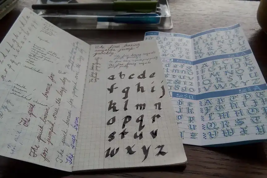
Buy the print book if your letters are not yet settled. Buy the joins book if they are settled and you want them to connect. Buy the spacing book if the letters are fine and the words are the problem. Two of the three is the usual set; all three is a year of pages.
The ruling, drawn to scale
Pick a height and the sheet redraws. The proportions are the ones in the books; only the screen scale is different.
Two bands of the 8 mm ruling, as printed in the print book. The heavier line is the baseline. Everything sits on it; only ascenders rise above the x-height line and only descenders drop below the baseline.
Every handwriting book we print is ruled to three heights. There are four lines to a band. The baseline is the heavy one, and every letter stands on it. The x-height line above it sets the height of a, c, e and the other small letters. The ascender line above that is where b, d, h, k, l and t reach. The descender line below the baseline is where g, j, p, q and y drop. A writer who keeps to those four lines has solved most of what makes a page look untidy, because the untidiness is nearly always one of those heights wandering.
The gap between bands matters as much as the band. Too small and the descenders of one line tangle with the ascenders of the next. Too large and the page looks like a form. We set it equal to the x-height, which keeps the lines close enough to read as text.
Ruling is printed in a pale blue that a pencil line sits over cleanly, and that a photocopy drops out. The model line at the head of each page is printed in black, at the same size as the ruling, so there is never a question of what size to write.
Who it suits, and who it does not
Read both lists before you order. The second one saves more people money than the first.
It suits
- An adult whose print is readable but tired, and who wants to settle it without going back to school.
- A child past the first year or two of school, who knows the letters and is ready for joins.
- Anyone who writes by hand for work, on labels, in a log or on a form, and wants the joins decided once so the hand stops deciding them each time.
- A left-handed writer. The letter forms are the same; the first spread of each book shows the left-handed page tilt and where the wrist rests.
- A school wanting one book per desk. Class sets are packed by title.
It does not suit
- Someone who does not yet know the letters. The book assumes you can read the model line. It is not a first reader.
- Someone who wants to be told what is wrong. A book shows the model and gives you the line. It cannot see your hand.
- Anyone who needs a ruling narrower than the 4 mm band at the end of the spacing book.
- Anyone after a decorative script. We print one plain joined hand, chosen because it is quick and stays readable at speed.
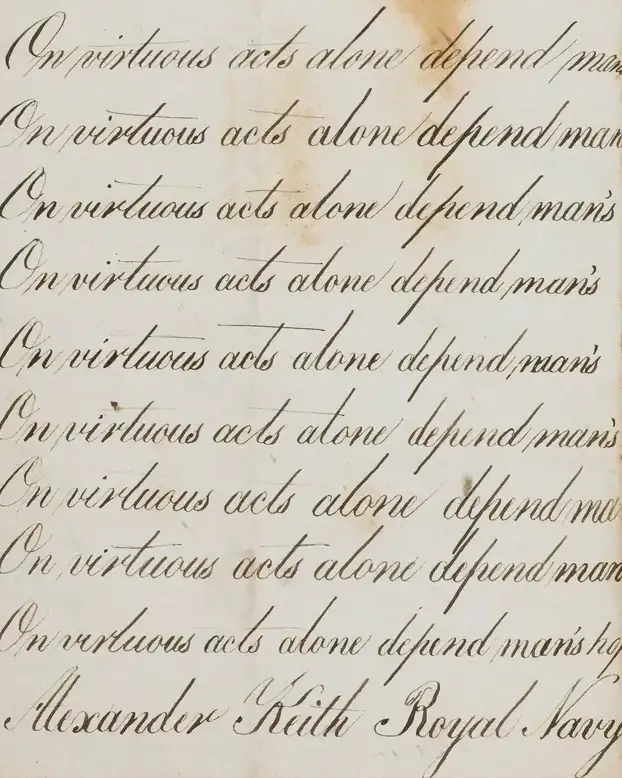
A book cannot tell you whether your grip is wrong. It shows the letter, gives you the line, and leaves the rest to you. If you want someone to watch you write, that is a different thing, and we do not sell it. If you want the pages, they are here.